
Product Photography for Remediate!: From Clean Studio Images to Lifestyle Game Photography
A Behind the Shoot case study from Nikita Photography Studios
Project Overview
For this product photography project, we worked with the ARC Centre of Excellence in Synthetic Biology to photograph Remediate!, a science-based card game inspired by synthetic biology.
The client needed a versatile collection of images for their website, digital advertising, email marketing, press and potentially online marketplaces. The photography therefore had to do more than simply show the packaging. It needed to explain what the product is, show what comes inside the box, highlight the colourful artwork and communicate the personality of the game. Remediate-product-photography-b…
Remediate! was designed to balance scientific credibility with accessible, enjoyable gameplay. The client described the tone as educational but not dry, smart but playful, and science-forward while remaining approachable. Remediate-product-photography-b…
That balance became the central photographic challenge.
The final brief called for approximately 16 images, divided between clean studio photography and more natural lifestyle imagery.
The Photography Brief
The client wanted the image library to work across several different situations.
The clean studio photographs needed to present the product clearly for eCommerce, advertising and marketplace use, while the lifestyle images needed to feel more natural and help communicate the experience of playing the game.
Another important requirement was making the different elements of the game easy to understand.
The game includes several card categories, particularly Microbe, Gene and Environment cards, and the client wanted those differences to be visible within the photography without attempting to show every card at once. Remediate-product-photography-b…
This meant composition was not just about making the photographs visually attractive. Each setup also needed to help explain how the product is structured.

Clean Studio Product Photography
The first part of the shoot focused on clean product photography against a white background.
The client requested a commercial look with professional lighting, minimal shadows and a strong emphasis on clarity and detail. Remediate-product-photography-b…
The studio shot list included several variations:
the closed box from different angles
the box alongside stacks of cards
the open box with cards visible
arrangements showing the different card types
wider compositions with cards spread around the product
The aim was to create enough variety that the client could select images depending on where they were being used.

Photographing the Closed Box
The simplest setup was the closed game box.
Even with a relatively straightforward rectangular product, camera position is important.
A front three-quarter view allows the viewer to see more than one face of the packaging, helping communicate the shape and depth of the box while still keeping the main artwork readable.
The dark blue packaging also contains relatively small text and detailed illustration, so the lighting needed to preserve the printed design without creating distracting glare across the surface.

Showing More Than the Packaging
A product like a card game needs more than a photograph of the closed box.
A potential customer also wants to understand what is inside.
For the next setups, we introduced stacks of the different cards alongside the packaging.
This immediately gives the viewer more information about the product while still retaining a clean commercial presentation.
The coloured card backs also helped introduce the structure of the game visually:
Gene — red
Microbe — blue
Environment — green
By showing these groups separately, the photographs communicate the product organisation without requiring a written explanation.

Arranging Cards for Product Photography
The more components that are added to an image, the more important the composition becomes.
With cards, it is easy for a photograph to become visually busy.
We therefore had to decide:
which cards should face the camera
which colours should appear together
how many cards could be shown without overcrowding the image
where the card stacks should sit in relation to the box
how much white space should remain around the composition
The client specifically wanted the artwork to remain one of the strengths of the image set, so several setups used individual face-up cards to introduce more colour and personality.

Keeping Card Text Readable
One of the challenges when photographing card games is the amount of information contained on a relatively small surface.
Each card includes illustrations, headings, descriptive text and game information.
If the camera angle becomes too low or the card is positioned too far from the camera, that information quickly becomes difficult to read.
For the product-focused setups, the cards were therefore positioned to maintain a clear view of the artwork and major text wherever possible.
The client had also specifically requested that the photography avoid harsh glare, maintain accurate colour and keep card text readable. Remediate-product-photography-b…
Creating Different Product Compositions
Rather than creating one arrangement and simply changing the angle, we built several different compositions.
Some photographs focused primarily on the box.
Others introduced the card stacks.
Some showed selected cards spread around the product, while wider setups presented more of the game components at once.
This gave the client a much broader image library.
A tight composition can work well for a product page or social advertisement, while a wider photograph with additional negative space can be more useful when text, graphics or advertising copy needs to be added later.
The original brief specifically asked for a mix of tight, medium and wider compositions, together with negative space for advertising and banner layouts.


Moving from Studio Photography to Lifestyle Photography
Once the clean product images were completed, we moved to the second part of the project: lifestyle photography.
The client wanted these photographs to feel more natural and approachable.
Instead of a pure white studio background, the brief suggested a warm-toned surface with subtle texture and a feeling closer to an elevated real-world game environment. Remediate-product-photography-b…
We used a warm timber surface to introduce that change of mood.
The difference is immediate.
The white-background photography focuses primarily on what the product is.
The timber-background photographs begin to communicate how the product might be used.

Recreating the Studio Compositions in a Natural Setting
Some of the lifestyle images intentionally followed similar compositions to the studio photographs.
The box, card stacks and selected face-up cards remained the main elements, but replacing the white background with a timber surface made the photographs feel less like conventional catalogue imagery.
This gave the client two visual treatments of the same product without requiring completely unrelated compositions.
That consistency is useful when images need to work across a website, social media and advertising while still feeling like part of the same brand.

Photographing the Game in Use
The next step was introducing hands into the compositions.
This changes the photograph from a product arrangement into a more recognisable playing situation.
A hand holding a selection of cards immediately communicates their size and gives the viewer a sense of how the product is handled.
At the same time, the box and additional cards remain visible in the background, keeping the product context clear.

Using Depth of Field to Direct Attention
For some of the closer lifestyle photographs, the cards in the hand become the primary point of attention while the playing area remains visible but softer in the background.
This creates a stronger sense of depth than the clean studio photography.
The viewer sees the important card artwork first, but can still recognise that a game is taking place behind it.
The client had specifically requested a combination of sharper product-focused images and more atmospheric depth-of-field variations, so this gave the final library greater visual flexibility.

Photographing Two Players
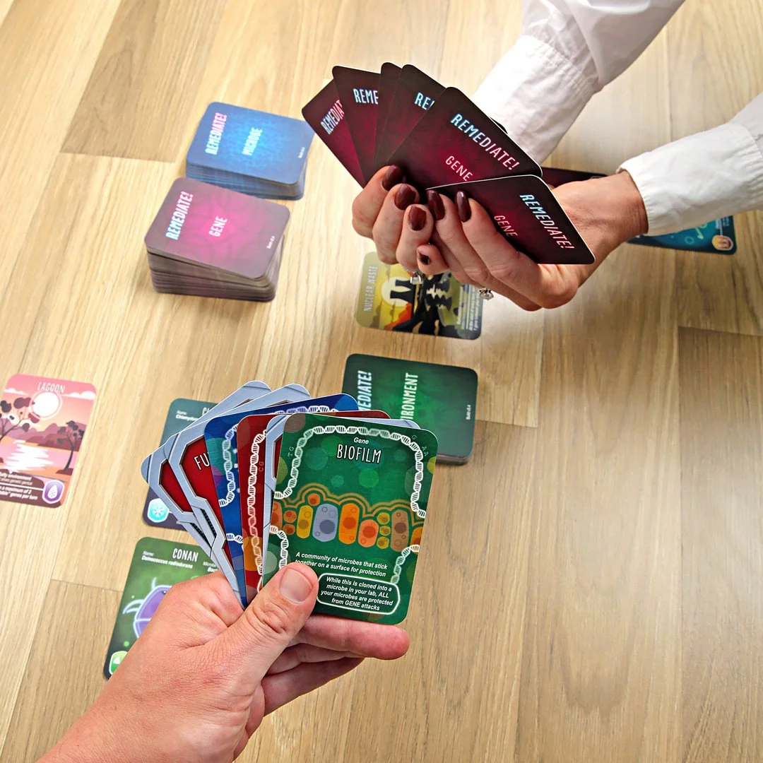
The final lifestyle setups introduced two players.
Rather than simply displaying the components, these images show the product in an active situation.
Both sets of hands hold cards while additional game cards remain arranged across the playing surface.
This helps communicate something that a conventional packshot cannot: the game is designed to be played with other people.
The photographs still needed to remain controlled enough for commercial use, but introducing hands made the result feel more spontaneous and relatable.
Balancing Product Clarity with Lifestyle Storytelling
The main challenge across this project was maintaining consistency while creating two very different visual styles.
The clean studio images needed to be precise, uncluttered and commercially useful.
The lifestyle images needed more energy and human interaction.
However, the product still had to remain clearly identifiable in both.
That meant maintaining:
accurate colour reproduction
readable card artwork
consistent packaging appearance
controlled reflections
clear separation between the product and background
considered card placement
enough variation between compositions to make the final library useful across multiple platforms
The result is a set of photographs that can serve different purposes without feeling disconnected from one another.
The Final Images
The final collection included approximately 16 photographs covering both clean studio product photography and lifestyle imagery.
The white-background images provide clear commercial views of the box, card stacks and individual game components.
The lifestyle photographs introduce the game in a more natural setting, including hands holding cards and two-player compositions designed to suggest the experience of an actual game in progress.
Together, the two approaches give the client a flexible image library for eCommerce, website content, advertising, social media and media use.
What This Project Demonstrates
This project demonstrates why product photography should be planned around how the final images will actually be used.
One product may require several different styles of photography.
For Remediate!, a simple photograph of the closed box would not have been enough.
The product photography also needed to explain:
what comes inside the box
how the cards are organised
the visual quality of the artwork
the scale of the cards
what the product looks like during use
the personality of the game
Clean product photography and lifestyle photography perform different jobs.
Used together, they create a much more complete visual description of the product.
Product Photography at Nikita Photography Studios
Nikita Photography Studios provides professional product photography for Australian brands, retailers, designers and eCommerce businesses.
Our Sydney studio produces clean eCommerce imagery, product collections, detailed packshots and lifestyle-style product photography for websites, advertising and marketing.
Each shoot is planned around the product itself and the way the final photographs need to function across different platforms.